Tag Archives: Wayfinding

Short, clear station names vital to transit system wayfinding

WMATA map with long station names: "they're not station names, they're committee meeting minutes."

WMATA map with long station names: “they’re not station names, they’re committee meeting minutes.”

The folks at London Reconnections have a new podcast – On Our Line. The second episode features a long conversation with two experts on transit map design and understanding, Max Roberts and Peter Lloyd.

The discussion hits on several topics about the challenges in transit map design, particularly for complicated networks. They also discuss objective measures of success in design (e.g. timing users in finding their way from point A to b on a map) and the conflicts with graphic design ideas. Another challenge is the future of the paper map and the seemingly inevitable move towards electronic map displays of some kind.

A few anecdotes stood out to me:

Touch Screen Maps: These might seem to be an obvious technological solution to mapping challenges with complex networks, frequent service changes, language barriers, etc. New York installed some touch screen maps as a part of a pilot program in 2014; despite rave reviews, no one seemed to use them. The podcast conversation (at 37:50) hits on the problems: the ad-supported model means the kiosks look like ads. Perhaps more interesting is the embarrassment of a rider using the kiosk, requiring a level of interaction that physically signals to everyone else on the platform that ‘I don’t know where I’m going.’ A static, printed map allows for consumption of information in a less obvious manner.

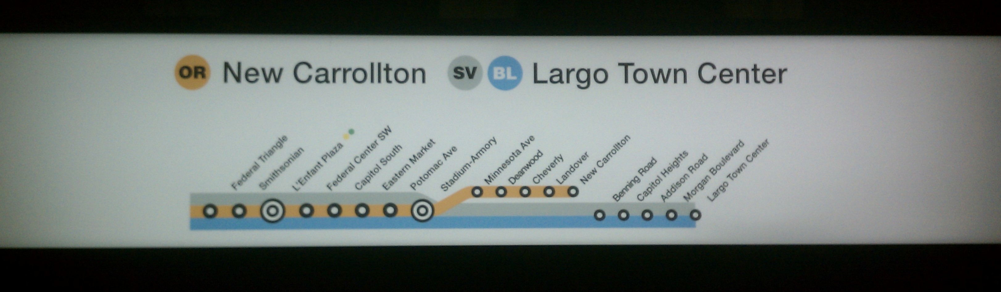
Station Names: Asked for examples of the worst transit maps they could think of, WMATA’s marathon-length station names are an obvious choice (at 1:07:20). Short station names are important to efficient, clear, and effective wayfinding. Roberts on WMATA’s map: “some of the stations – they’re not station names, they’re committee meeting minutes.”

File that one under “it’s funny because it’s true.”

Using the map to influence routing: Roberts obliquely mentions working with WMATA (48 minutes in) on changing the map to encourage different routing, presumably a reference to adjusting the map in order to encourage Blue Line riders from Virginia to transfer and use the Yellow Line (with excess capacity) to travel into DC.

It’s one thing for the map (or trip planner) to influence your route; it’s another for that decision to be made by an algorithm completely removed from human interaction. With driverless cars, it’s still unclear how humans will react to navigating networks in that way – adjusting human behavior is challenging enough.

BRAC, but for WMATA station names

What’s in a name? Recently, a WMATA Board committee voted to add destinations to the Foggy Bottom and Smithsonian stations. The two will soon be “Foggy Bottom-GWU-Kennedy Center” and “Smithsonian-National Mall” stations, respectively. Matt Johnson at Greater Greater Washington has a good read on why these name additions are a bad idea and will add to rider confusion. But leaving aside the merits of WMATA’s station name policy, the inability to follow that policy is a case-study in importance of decision-making architecture.

The changes contradict WMATA policy, last considered in 2011 when there was universal agreement about problem: station names were often too long, multiple names for a single station was confusing, and the required changes in signage (updating every single map in the system) were substantial and usually understated. Yet, the Board can’t resist adding destinations to station names.

There will always be a constituency for adding a destination to a station. It speaks to the great power of a transit station to define a neighborhood. These name change requests are coming up now, in advance of the opening of Phase 2 of the Silver Line (which will require re-printing every map in the system, changing lots of signage, etc). So long as the ultimate decision about station names sits with the WMATA Board, individual Board members will always be subject to lobbying from name-based interests.

WMATA’s official policy acknowledges the problems with station name sprawl – there’s agreement about the issue, but an inability to follow through. The name policy reinforces two basic ideas, that station names should be distinct, unique, and brief:

  • Distinctive names that evoke imagery; using geographical features or centers of activity where possible
  • 19 characters maximum; preference for no more than two words.

The very idea of adding to a station name (so that station now has two names) violates both principles – the name is no longer singular, and it’s longer than necessary.

This suggests a problem in the structure of the decision-making. Changing the decision-making process could better align the outcomes with policy. The simplest solution is to simply remove the Board from the equation and let staff make all decisions. However, if that isn’t acceptable, there is another model to consider – one similar to the Department of Defense’s Base Realignment and Closure (BRAC) Commission.

BRAC is a solution to a similar type of problem. Towards the end of the Cold War, there was universal agreement about the need to downsize the military and close and/or realign redundant, outdated, or unnecessary facilities. However, because of the importance of each facility locally, members of Congress would lobby hard on the DoD to keep those bases open. Any action to close bases through Congress would be subject to all sorts of legislative logrolling. The interests of individual members proved unable to meet the overall goal.

The procedural solution of the BRAC Commission was simple: form a commission to develop a list of bases to be closed, based on objective criteria all parties agree on in advance. That list of recommended closures must then be either approved or disapproved by Congress with no alterations or substitutions. Congress was willing to delegate this authority to a commission as a means of solving their own collective action problem.

One political science review of the process notes three key elements that make this delegation of power successful: agreement about the goals, agreement about the steps required to meet the goals, and a narrowly defined scope.

Imagine a BRAC-like process for WMATA station names. Agreement about WMATA’s unwieldy names, agreement on the policy to apply, and a narrow charge to an independent committee to propose changes are all in place. If I were a member of that committee, I might propose a list looking like this:

wmata station names 1-2

wmata station names 1-3

This proposal changes the names of 28 stations. The list includes stations planned (Potomac Yard) or under construction (Phase 2 of the Silver Line); it also assumes the addition of the National Mall and Kennedy Center under the ‘current’ station names.

Highlights from the proposal:

  • Dramatic reduction in the number of stations in direct violation of the character limit – from 20 to 3.
  • Sorry, local universities: you’re off the list of names. Unless a university builds a station on campus (and ‘Foggy Bottom’ is more distinctive than ‘GWU’ – sorry, Colonials), it’s hard to justify appending all of these acronyms.
  • Despite an effort to remove hyphenated names, some remain. Navy Yard-Ballpark has legit wayfinding benefits; Stadium-Armory loses the ‘stadium,’ noting that a handful of confused baseball fans still travel to the wrong station even though the Nationals haven’t played at RFK Stadium since 2007.
  • Those pesky airports: with Metro coming to IAD, it’s worthwhile to spell out ‘International’ in contrast to DCA. The proposal distills down to MWAA’s own shorthand: Reagan National and Dulles International.
  • None of the changes are re-branding efforts – all of the ‘new’ names are either part of the existing names, edited for brevity and clarity.

Imagine this proposal put forth to the WMATA Board for an up or down vote…

Even more signs that the Silver Line is coming…

We still don’t have word on a start date for WMATA’s new Silver Line service to Tysons Corner, but more and more signage for the service is appearing in the rest of the system.

New signage, complete with (SV) bullets at Federal Center SW Station. Photo by the author.

New signage, complete with (SV) bullets at Federal Center SW Station. Photo by the author.

This signage is from the platform pylon near the base of the escalators at Federal Center SW.

Via Twitter, Dan Malouff (@BeyondDC) took note of the new (SV) bullets on one of the narrow pylons used for Metro’s side platform stations, wondering if the bullets are using a different typeface from the rest of WMATA’s signage:

The answer is: sort of. The graphic standards (which I stumbled across via googling for this post) for the Rush Plus signage changes note that the bullets use Helvetica Bold, while the rest of the text uses Helvetica Medium.

Signs that the Silver Line is coming…

As WMATA prepares to take control of the first phase of the Silver Line from MWAA (with the exact handover date yet to be determined), signage for the new service is starting to pop-up around the system. WMATA is trying to raise awareness about the new service and new track with a dedicated website; you can see a presentation to the WMATA Board on their Silver Line activation plan here.

Some rail stations include strip maps on the station wall signage and on platform pylons. Others include backlit strip maps located above the on-platform map/advertising panels. In several stations, these maps have been updated with new Silver Line information:

Backlit strip map above one of Metro's platform ad panels at the Federal Triangle Station. Photo by the author.

Backlit westbound strip map above one of Metro’s platform ad panels at the Federal Triangle Station. Photo by the author.

Backlit strip map at Federal Triangle, including Silver Line to Largo. Photo by the author.

Backlit eastbound strip map at Federal Triangle, including Silver Line to Largo. Photo by the author.

In recent months, WMATA has installed new wall signage in Blue/Orange stations. The signage included awkward spacing for the lines/destinations, preserving space for the future inclusion of Silver Line services:

New wall signage on the westbound track at Eastern Market, with room for Silver Line information below OR and BL. Photo by the author.

New wall signage on the westbound track at Eastern Market, with room for Silver Line information below OR and BL. Photo by the author.

The current signage makes for an odd asymmetry, where the westbound signs clearly preserve space for a future (SV) bullet and destination below the current Orange and Blue line termini. The eastbound signs, however, looked more evenly spaced, perhaps anticipating the end of Orange Line ‘Rush Plus‘ service to Largo, to be replaced by Silver Line service. The revised sign will include a similar look to the eastbound strip map spotted at Federal Triangle.

The demise of at least some of the difficult-to-read striped Rush Plus bullets can’t come soon enough.

Eastbound wall signage at Eastern Market; awkward space above OR and BL destinations is reserved for future SV service. Photo by the author.

Eastbound wall signage at Eastern Market with ‘normal’ spacing; OR ‘Rush Plus’ service to Largo likely to be replaced with an SV bullet. Photo by the author.


Miscellaneous information and visuals about Dulles International Airport

MWAA IAD signage standards

In the process of scouring the internet for sources for my previous post on growing air cargo traffic at Dulles International Airport, I came across a whole host of interesting documents and information that I couldn’t find a way to fit into the narrative. So, here’s a smorgasboard of some tangentially related items I found interesting.

The image above is one example, showing spacing for wayfinding signage at IAD. Some signage uses the ‘Saarinen’ typeface, designed by Eero Saarinen specifically for the airport. The graphic is from IAD’s extensive Airport Design Standards and Signing Guidelines document, a document that not only establishes standards for the aesthetics of the airport, but also reveals the future plans for expansion at IAD.

The challenge of costs: The cost per enplanement at Dulles has risen above the median for peer airports as MWAA engaged on IAD’s capital construction program. DCA’s constraints don’t provide room for growth, but don’t require large capital expenses, either:

MWAA IAD CPE forecast

Growth potential: Dulles has room to grow and handle 3x as many passengers as it does today, and with a significant increase in airfield capacity as well.

MWAA IAD plan gates

MWAA IAD plan airfield

Future layout: While the planning consistently shows four tiers of midfield concourses, the schematic from the Design Guidelines re-names the terminals to follow the sequence of an Aerotrain trip, rather than the current nomenclature:

MWAA future terminal layout

Regional competition among Washington-area airports: Dulles handled the most passengers in 2012, but all three airports are very similar in overall traffic levels. Dulles has the most connecting traffic (42% of passengers connect) and the fewest number of origins/destinations in the DC area. Dulles also has (by far) the international traffic:

MWAA regional traffic connect intl

At the same time, the FAA forecasts for growth show Dulles taking the majority of the incremental air traffic for the region:

MWAA regional traffic FAA forecast

Development opportunities: An illustrative example from MWAA’s strategic planning documents showing the land available for development at the airport:

MWAA IAD dev opps

The northern-most of those orange blobs is a potential transit-oriented development project at the Route 606 Metro Station.

Parking symbols: From the Design Guidelines, examples of sky-related symbols for parking wayfinding:

MWAA parking symbols

MWAA parking symbol example

Graphic standards on the Subway – a lesson for Metro as it evaluates the future of ‘Metro Brown’

Today, Second Ave Sagas linked to a digitized copy of Massimo Vignelli’s 1970 graphics standards manual for the New York City Subway. The photographed pages of the manual describe, in exacting detail, the graphic look and feel and philosophy of wayfinding signage for the Subway. While Vignelli’s schematic map (a scan of the map can be found here; discussion of the map’s legacy here and here; and for more from Vignelli himself, see this outtake from Helvetica) didn’t make it out of the 70s, his graphic legacy lives on through the system’s signage.

Henry Grabar wrote about the digital version of the manual in Atlantic Cities in March, adding some history to the conversation. One such change was the inversion of the standards from black text on a white background to the system’s current white text on a black background as a measure to discourage graffiti, though there are claims that white on black is more legible. On a temporary basis, some black-on-white signs have returned.

One of the more interesting pages from the manual shows how signs showing options should only appear at decision points along the way to a train – not before, and not after:

The text at the top of the page reads (out of the frame of the screen capture above, view the full page with magnification to read the text):

This diagram explains the sequence of information to the subway rider. It is a branching system that will lead him to his destination as directly as possible. The basic concept of this branching system is that the subway rider should be given only information at the point of decision. Never before. Never after.

All of the discussion about the manual emphasizes the power of standards. For a detailed history of New York’s struggle with diverse signage, see Paul Shaw’s online work, based on his book. The history of New York’s signage is understandably turbulent, but the level of coherency that comes through for users given the scale of the system is remarkable.

This puts Metro’s recent discussions about moving away from ‘Metro Brown’ into context. If any of New York’s standards look familiar, it is because Vignelli worked on both systems. Vignelli was a consultant to Harry Weese (architect), along with Lance Wyman (map designer), and reportedly was the one to coin the name ‘Metro’ and create the ‘M’ logo. Given the efforts in New York to standardize wayfinding signage, why move in the opposite direction now?

What’s wrong with ‘Metro Brown?’

Last week, the Washington Post featured a lengthy profile of WMATA’s head architect, the man behind the concepts in Metro’s recently unveiledstation of the future‘ concept. The article offers some insight into the thinking behind the proposed re-design of the Bethesda station, as well as some of the pushback Metro has received already from the Commission on Fine Arts (among others).

Some changes seem sensible, like higher-output light fixtures to replace current fixtures, with the goal of increased light levels while staying true to Harry Weese’s indirect lighting scheme. These seem more like mechanical or operational challenges for the most part, the kind of behind-the-scenes stuff that won’t make such a huge difference in the appearance of stations.

Other proposals seem like change for the sake of change: replacing bronze with stainless steel, for example:

Karadimov acknowledges bronze as a central element of the “original palate” of Metro. But operationally, it is not ideal. Bronze needs polishing, not just cleaning, and the grime on the railing in Bethesda easily comes off to the touch. In the NoMa-Gallaudet and Largo stations, some of the system’s newest, there are already stainless steel railings that Karadimov says are less expensive to clean (though he did not have a cost estimate) and lighter in color. Same for the first group of five Silver Line stations under construction and the canopies that cover some Metro entrances.

Karadimov proposed replacing the bronze railings and escalator panels throughout the Bethesda station with stainless steel; after criticism over the idea of stripping out so much bronze, however, he retreated, agreeing not to replace the bronze with stainless steel or any concrete parapets with glass. Instead he says Metro will keep all its bronze railings. But he says the escalator panels are a less central element that needs replacing. “That is one thing that we are going to have to have a further conversation about,” he said.

While stainless steel might require less maintenance, that doesn’t make it maintenance-free. Plenty of Metro’s entrance canopies are already showing their age, along with accumulated dirt and grime. Likewise, I can’t see any objection to the use of stainless steel features in new stations, but fail to see why this is such a critical element for the improvement of existing stations. If an escalator replacement opens the door for a stainless steel enclosure instead of a bronze one, so be it – this would hardly be Metro’s first stainless escalator. However, that reasoning doesn’t apply to bronze railings that are not in need of replacement.

Stainless steel station elements at NoMa-Gallaudet U Station. Photo by author.

Aside from bronze, the other element of Metro’s aesthetic under attack is the color brown:

But if the stations are to get brighter, Karadimov said, brown cannot continue to be the dominant color. “We’re not going to keep any brown,” he said. “We believe that having a lighter color will help make the station more bright.”

Like the bronze, brown unquestionably contributes to the placid feeling of the stations, but Karadimov said it contributes just as strongly to views that the stations appear dated. Whether the agency will have to retreat on the color brown as it did on bronze has not been decided.

Karadimov also has not formally proposed a color to replace it. He talks about light gray and silver, which he said would make signage easier to read, but without stainless steel to pair it with he may have to reconsider.

As ubiquitous as brown is within the Metro system, it is by no means the dominant color inside stations. The complaint that bronze is too dark seems to ring hollow, as well. Concrete and the red tiles are far more dominant in the palate than either brown or bronze.

Brown elements are limited to accent pieces and signage. The shade of brown itself is so dark that it doesn’t readily register as a brown at all, but almost a black-brown. Contrary to the assertion from Metro, this dark background provides a great deal of contrast for white lettering, making signage easy to read. White text on dark backgrounds is hardly unique to DC in terms of mass transit signage, either.

Combination of stainless steel, painted steel, and brown signage elements at NoMa-Gallaudet U Station. Photo by author.

Even in Metro’s newer stations (those not a part of the originally planned system), Metro’s white-text-on-brown-background signage standard remained intact. Why change it now and disrupt the uniformity across the system?

The addition of gray elements to Metro’s signage scheme is not new, either. Gallery Place, WMATA’s designated ‘test’ station for new signage, has seen lots of designs over the years, including different background colors and fonts and backlit signage, and the use of gray backgrounds for directional arrows – but none abandon Metro Brown.

Metro’s ‘station of the future’ – why mess with what works?

This week, WMATA unveiled a concept for their “station of the future.” The press release and accompanying video flythough of the pilot station (Bethesda) for these improvements lists the reasons for these changes, including “improved lighting, better information and improved customer convenience.” And who would be against those things? All three have been criticisms of Metro in the past, particularly station lighting.

However, what they’ve shown in the ‘station of the future’ looks a lot more like a wholesale redesign of some of Metro’s iconic station architecture. Dan Malouff at BeyondDC lists the six concepts to be tested:

  • New wall-mounted lights along the length of the platform, and new information pylons with larger signs and more real-time displays.
  • Reflective metal panels along the vending wall will be brighter, eliminate shadows, and reduce clutter.
  • Smaller manager kiosk will make room for more fare gates, which will be reflective metal instead of “Metro brown”.
  • Anti-slip flooring at the base of the escalators.
  • Overhead lighting in the mezzanine.
  • Glass walls replace concrete, allowing more light through.

All together, that’s a mix of sensible station improvements, but also some serious assaults on the system’s architecture and design.

Some of these shouldn’t be controversial at all, such as the non-slip flooring at the base of escalators instead of Metro’s notoriously slippery tiles. Likewise, ticket vending and customer information displays mounted into the mezzanine walls seems like a welcome change. Smaller station manager kiosks in order to provide more faregates makes sense; however, the current renovations on the Orange/Blue lines in DC are putting in larger kiosks, not smaller.

Other changes aren’t new concepts, but rather long-standing challenges Metro has looked to address. The overhead lighting in the mezzanine appears from the flythrough to be the same light fixtures Metro tested at Judiciary Square. The quality of the lighting tends to be cool and harsh (a common trend for WMATA recently), but it’s certainly brighter for mezzanine users (and not nearly as abrasive as WMATA’s Friendship Heights experiment using Metro’s outdoor pylons indoors).

Glass parapet walls have been used in other stations, as well – most recently in the baseball renovations at Navy Yard. That staircase, however, is a rather surgical change to the station, cutting a hole in the mezzanine floor where there was none before. This concept proposes replacing an existing concrete parapet with glass.

The ‘station of the future’ proposes three really big changes to Metro’s design: eliminating ‘Metro brown’ in favor of stainless steel; a completely new winged pylon design; and indirect lighting provided by new wall-mounted fixtures that can double as station signage.

It’s not clear to me what’s wrong with Metro Brown. Given the multitude of other options available to improve lighting, blaming the limited amount of brown metal panels in the stations seems like a stretch. Given the cost to Metro’s architectural legacy, it’s hard to see how this is worth it.

Metro’s desire to distance itself from the color brown isn’t new. The three newest stations in the system (and not part of the originally planned system) make use of glass and stainless steel, but still use Metro brown for signage and entrance pylons. Metro’s newest railcars will ditch the brown stripe at window level in favor of a gaudy disco-ball logo.

The voiceover in WMATA’s video expresses concern about brown representing a dated look, but I’m not sure anyone really objects to the color and the role it plays in Metro’s overall visual brand. The brown pylons and signage have aged well compared to Metro’s original car interiors or the idea of carpeting. Why change what works?

It’s hard to tell the extent of the use of stainless from Metro’s flythough of what looks to be a Sketchup model, but the voiceover makes it seem possible that the new pylons could be stainless; the Sketchup signage in the flythrough is the same color as the pylon, making it hard to tell which elements are steel and which would be Metro brown.

The stated benefits of the pylon re-design seem dubious. The winged directional signage seems unnecessary to me, and putting wings on each and every pylon clutters the space created by Metro’s vaults. Adding more PID displays is a positive, but I’m not sure that many displays are necessary. Two or three along the length of any platform would probably suffice.

System wayfiding is important, but there are lots of other ways to accomplish that goal without adding wings telling you which side of the platform is for outbound trains to every pylon. Likewise, one of the benefits to Metro’s spacious vaulted stations are the clear lines of sight in most stations – alighting passengers can usually see their exit mezzanine within direct view, providing intuitive wayfinding within stations.

I’d bu curious to know if the goals of improved lighting from the indirect fixtures mounted into the walls could be just as easily met with better maintenance of the existing trackbed lighting, cleaning station vaults more regularly, and looking into the use of newer technologies like LEDs in existing lighting locations for both higher lighting levels and lower maintenance requirements.

Wayfinding challenges for WMATA’s Rush Plus

WMATA’s recent service change, branded as Rush Plus (probably over-promising things just a bit as “rush hour reinvented”), involved deviating from Metro’s fairly straightforward delineation of lines and services via color.  Metro’s increasingly complicated service pattern is getting to the point of requiring a similarly robust nomenclature for services.

When a rider speaks of the Red Line, they refer not just to a set of tracks but also the service that operates on them.  Even this wasn’t perfect, as many Red Line trains wouldn’t operate for the full line – they would short-turn at Grosvenor or Silver Spring.  GGW’s Metro Map contest identified each of the separate services Metro regularly runs, counting ten current services, plus the future Silver Line.  Ten services is obviously more than the five colors on Metro’s map.

More problematic is the fact that color and line terminus are no longer paired.  Yellow line trains can terminate at both Franconia-Springfield and Huntington; Orange line trains can terminate at both Largo and New Carrollton.

When devising a new map to show these service changes and to prepare for the introduction of the Silver Line, Metro opted to keep the map (and service nomenclature) that riders know well the same.  However, the increasingly complex service pattern demands nomenclature to match.

WMATA’s move towards using colored bullets to help identify train services helps:

However, those bullets still only identify the all-day services, not the ‘Rush Plus’ services.  WMATA’s in-station signage uses something else:

YL Rush Only service bullet, GR bullet. CC image from justgrimes.

The striping within the bullet matches the pattern for such services on Metro’s new map, but it just doesn’t read well on in-station signage:

Rush Plus signage at Gallery Place-Chinatown. Photo by author.

From afar (or in the above case, just standing at the platform), you can’t tell the difference between the rush-only YL bullet and the regular service YL bullet.  Which means that the bullet isn’t useful for wayfinding if the rider still needs to focus on their terminal destination.  A different rush-only YL bullet adds nothing.

One potential solution would be to take a lesson from a system that has lots of different services, operating on different lines (both are distinct concepts) – New York.  Differentiation among similarly routed services can be accomplished via graphical means.


For some rush-only, peak-direction-only services, New York’s diamond bullets might work as an example for Metro’s rush-only services. Regular Orange Line trains [identified as (OR) in shorthand] would go to New Carrollton, while rush-only trains [identified with a diamond <OR> bullet] would go to Largo.

This wouldn’t solve all of Metro’s service naming challenges – the fact that some rush-only services bring new service to places (like more trains to Largo) while other services do not (how most Yellow trains at the peak end at Mount Vernon Square, not the ‘regular’ listed terminus of Fort Totten) and that some service patterns are not rush-only (short-turning trains on the Red Line at Grosvenor and Silver Spring) makes a simple switch difficult. Still, there’s a need to change.

This isn’t the first time this issue has popped up, and so long as Metro’s services are getting more (and not less) complex, it won’t be going away anytime soon.

Observations from San Francisco

As a nice respite to DC’s heat, I was able to spend the last week in California – including several days in San Francisco.  Some thoughts and observations from the trip:

IMG_4949

Hills and Grids: Gridded streets have plenty of benefits, to be sure – but the downside is that they do not react to topography.  San Francisco provides the extreme example.  The city has even preserved the right of way where topography makes streets impossible.  My own adventure to the top of Telegraph Hill included ascending the Greenwich Street stairs.

Surely, relaxing the grid would offer opportunities for a more understanding development pattern.  Nevertheless, the spaces along the staircases are certainly interesting, as are some of the extremely steep streets.  Such a pattern would not work in a colder climate that has to deal with ice and snow on a regular basis, however – lest you end up like these poor folks in Portland.

800px-FilbertStreetAndGrantAvenueLookingTowardsCoitTowerAndGarfieldElementarySchool

Trucks and Buses not advised.  Um, yeah.

Trolleybuses: As a direct response to the city’s grade issues, the electric-powered trolley buses are a great solution.  The overhead wires for the buses can be a little obtrusive – but they are not nearly as much of a visual blight as the broader patchwork of utility wires strung from house to house and pole to pole.

IMG_4966

Zero emissions, but the wires (like rails) do act as a visual cue for a newcomer to the city (like myself) to find a bus line when I need one.  That’s a plus.

Signage: Actual signs telling you where you are or what transit line to take, however, are sorely lacking – particularly for Muni and BART.

IMG_5029

We can do better than this – the BART platform at Montgomery station.  The boarding signs for various train lengths is nice, but not all that intuitive – but actually determining which station you’re at when the train arrives is another challenge entirely.  Similarly, on the Muni lines that turn into streetcar routes in the outer neighborhoods, signage at the larger stations is almost non-existent – certainly not useful for a first time rider.

That said – Muni’s route symbology is incredibly easy to understand.  Each line is assigned a name (corresponding to the main street it travels on), a letter (as a single symbol) and a color.  It’s something I think Metro could learn from as its route structure becomes more and more complex.

Wayfinding signage around town, however, was much better.  Kiosks offered maps, highlighted transit routes, and in general provided very useful information – even potential ferry routes, for example:

IMG_4993

My favorite ‘signs’, however, where the ones doing double duty – the public toilets:

IMG_4996

Granted, the actual map here is faded and hard to read, but the presence of a self-cleaning public toilet in a popular tourist area like this is priceless.  Thanks to nature’s urges, I never had a chance to actually use one – but the process seems quite self-explanatory.  If not, there are simple instructions:

IMG_4998

This particular toilet is from JCDecaux, the same outdoor advertising firm that operates Paris’ Velib bikesharing system.

Streetcars: The F Market line’s heritage streetcars are both interesting to see on the street and also an effective part of the transit network.  They’re also quite popular:

IMG_4977

One note about these old PCC cars – when you’re standing (as I was while taking this picture), it’s extremely difficult to see out the small windows of these old rail cars to determine where you are – especially with Muni’s aforementioned lack of quickly visible signage.  The PCC car wiki page talks about “standee windows,” but these weren’t of much help to me.

From the outside, the diverse colors of the various liveries from around the world Muni opts to use are fantastic.

IMG_4979

IMG_5008

The liveries include this lovely pastel DC Transit paint job.

More (perhaps) to come later.